Why color as the only way to convey meaning can be an issue
Using color as the only way to convey meaning can create issues for people who are color blind and people who are blind, deaf-blind, or have low vision. In the case of someone who is color blind, they may not be able to distinguish between certain colors such as red and green, or they may actually not see colors at all (known as monochromatic vision).
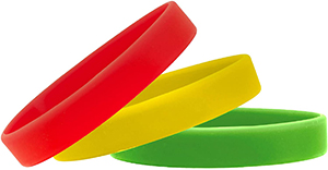
The example below is a bracelet concept someone came up with once vaccines were available as a way for people to communicate whether they were fine with hugs, okay with talking, or wanted others to keep their distance at events. These bracelets came with a sign that indicated which color represented which preference. However, there were two issues with this solution. The first was that it failed to keep in mind that not everyone sees colors the same way. A filter has been added to the image to simulate deuteranopia, which is a type of red-green color blindness characterized by the inability to distinguish red and green pigments. Can you tell the difference between the red and the green?
Original image

Deuteranopia simulation

The other main issue was the solution didn't take into consideration if someone was blind, deaf-blind, or had low vision. If the person had low vision, they may have to stand close to the person to evaluate the bracelet - perhaps too close in the case of social distancing. For a person who is blind or deaf-blind, even if braille was added to the bracelet, that would again prevent a person from social distancing to determine another person's preference.
While this is a physical example, keep in mind your excel spreadsheets where you color code rows or text without any other means of conveying that information.
What are ways to convey meaning outside of color?
It depends on the scenario. Here are a couple of examples that will help with your decision making process:
- If using red, yellow, and green to denote statuses in a spreadsheet, consider also using a text equivalent of that status in the status field, such as showstopper, at risk, and no issues.
- If using color to convey statuses in an interactive graph (for example, a bar graph), display both the label and consider presenting the graph either in gradients of the same color family (for example, blue) or adding patterns to the bars as an additional identifier. Also ensure that the label is picked up by assistive technology. If the graph is not interactive and instead a static image, the label will not be read so you would either add alt text above the image or if the image was complex, you could include a detailed description below the image and set the image as decorative.
- If using red to denote important content, always bold the content as well.
